ABOUT THREEMINDS
Who We Are
We are a Dubai-based company, established with one clear mission in mind, offering architects, interior designers and customers the latest trends in each product it represents with undivided attention to acknowledged quality standards , service and great efficiency in performance and after sales service.
What We Do
Our streamline business is supplying interior design and decoration material, The currently available product range is just a part of larger one that is yet to come.

What We Also Do
Having the required expertise on board, we also assist with design, technical support and decoration material sourcing.
Our Values
Integrity
Honesty
Trust
Commitment to Customers
Continuous Learning
Constant Improvement
Quality Team Work
Our Methodology
From start to finish , our methodology is taking an active and careful role in assisting our customers on all levels from design to execution offering them our previous experience and current knowledge in pursuit of perfect results.
Our Philosophy
We strongly believe that every design is the heart and soul of its creator and every project, large or small, is the dream and hard work of its owner and it deserves nothing less than our complete devotion.
OUR PRODUCTS
A quickly evolving interactive studio for everything that’s next with
focus on interior design and, decoration material.


TOP NOTCH SERVICES
We provide the exceptional service we’d want to experience ourselves!
Let’s make something awesome together.

Technical Support
Woodworking Product Value Engineering
Shop Drawings Support
Product Testing Support
Product Evaluation

Product Procurement
3MINDS Offers Quick And Reliable Sourcing For Your Woodworking Product Needs.

Development
With Good Experience And Good Affiliations, 3MINDS Could Play Good Role In Product Development To Serve Particular Purpose.
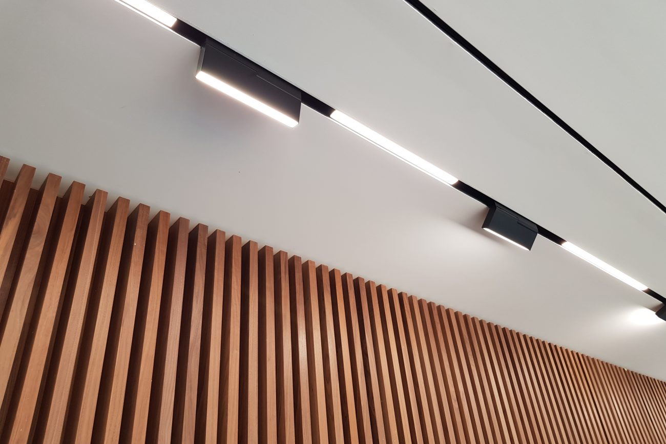
FEATURED PRODUCTS
Keeping Up with The Trend In Architecture And Design, 3MINDS Casts a light On

Thin layer of real beton, crafted with passion to brut concrete look. It is the only beton sheet carpenters can work with whether in workshop or on site with extreme ease and convenience in cutting, pasting and installing.
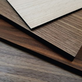
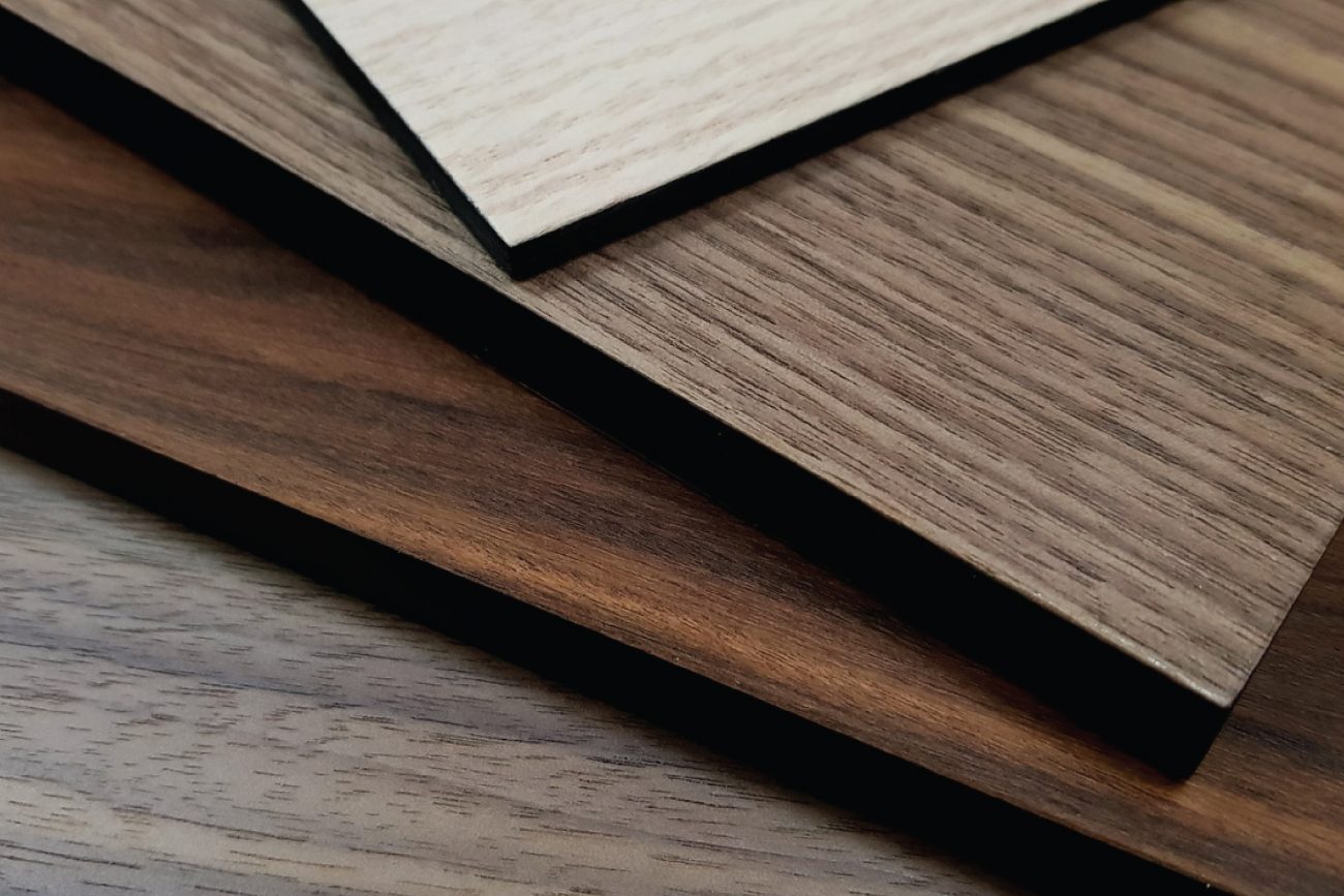
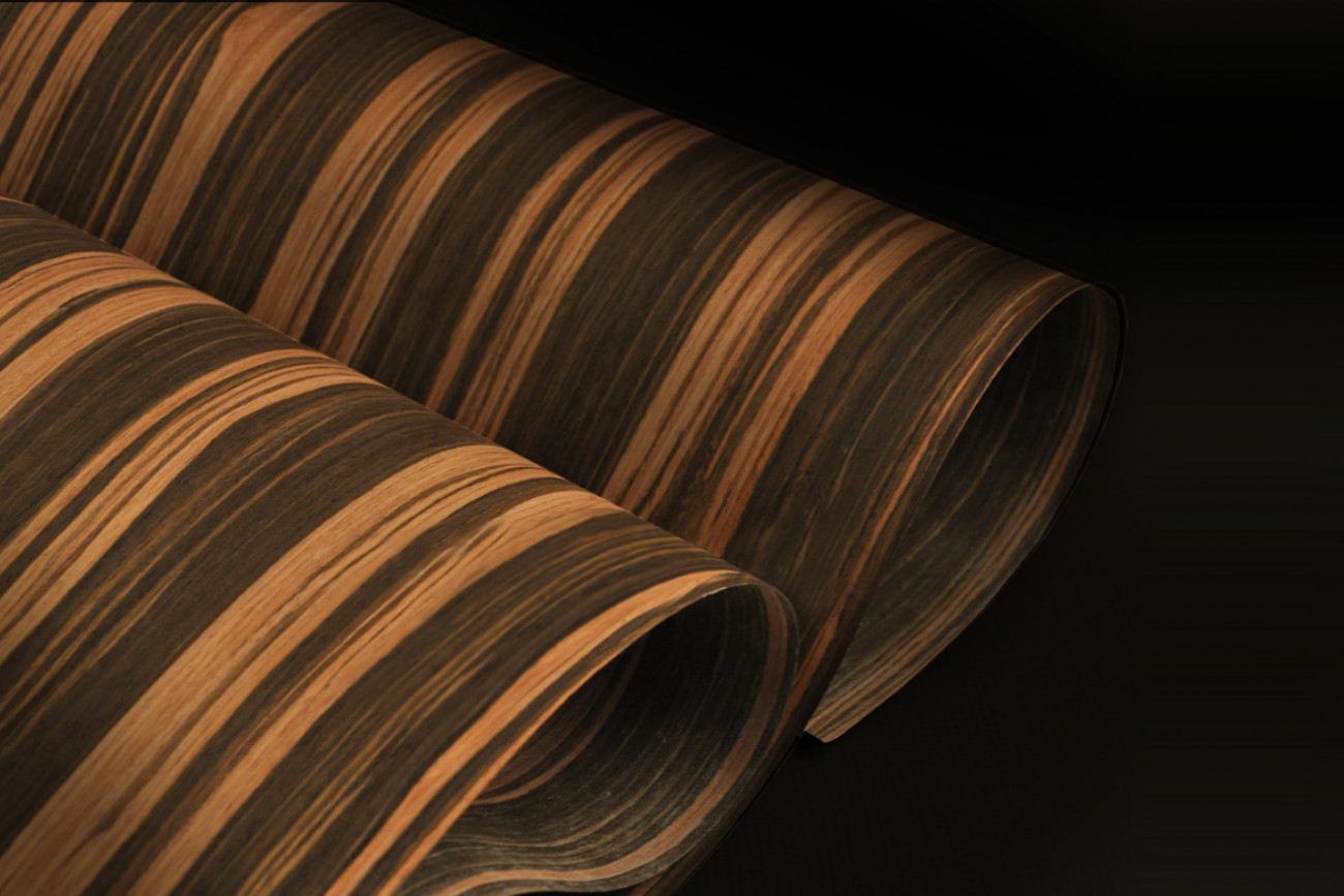
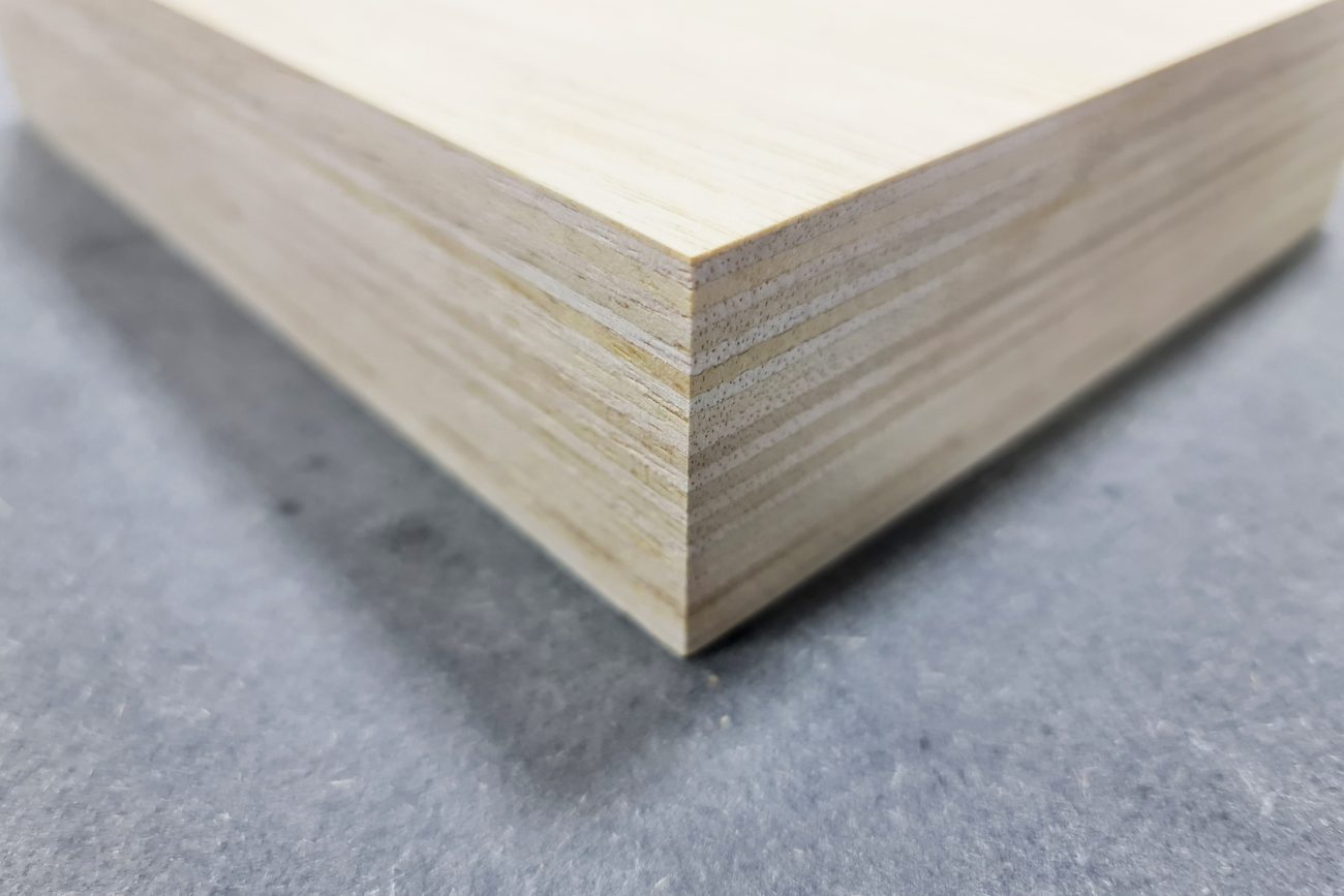
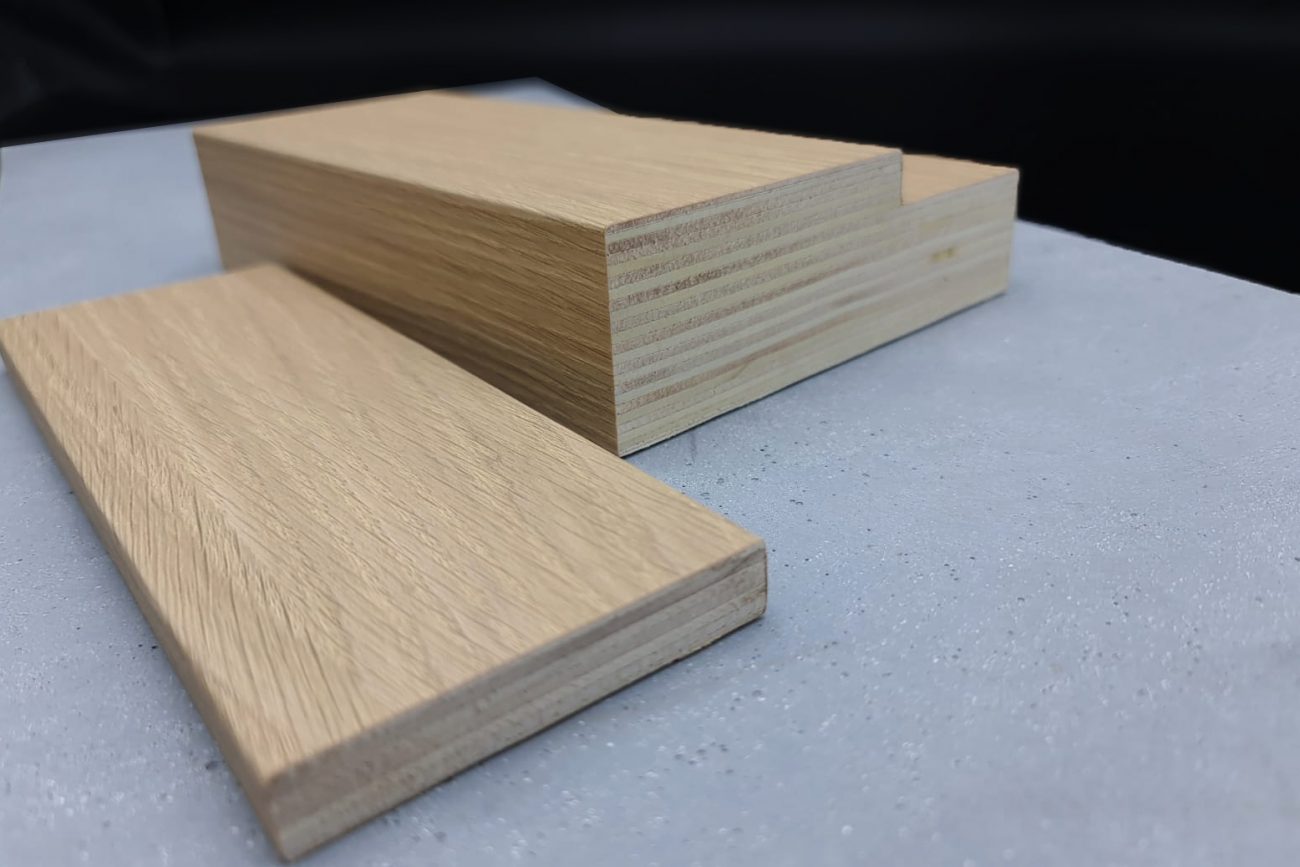
Natural Veneer Compact Laminate
Lamex Laminate revolutionizes the industry offering a wide range of compact laminates faced with Real wood veneer making compact laminate an item of luxury.
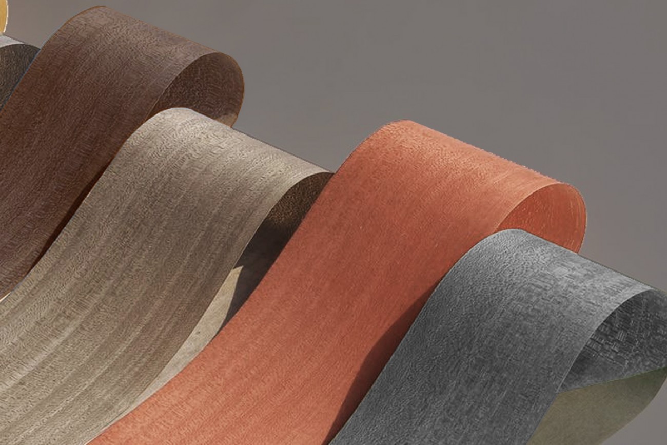
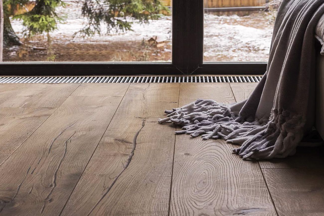
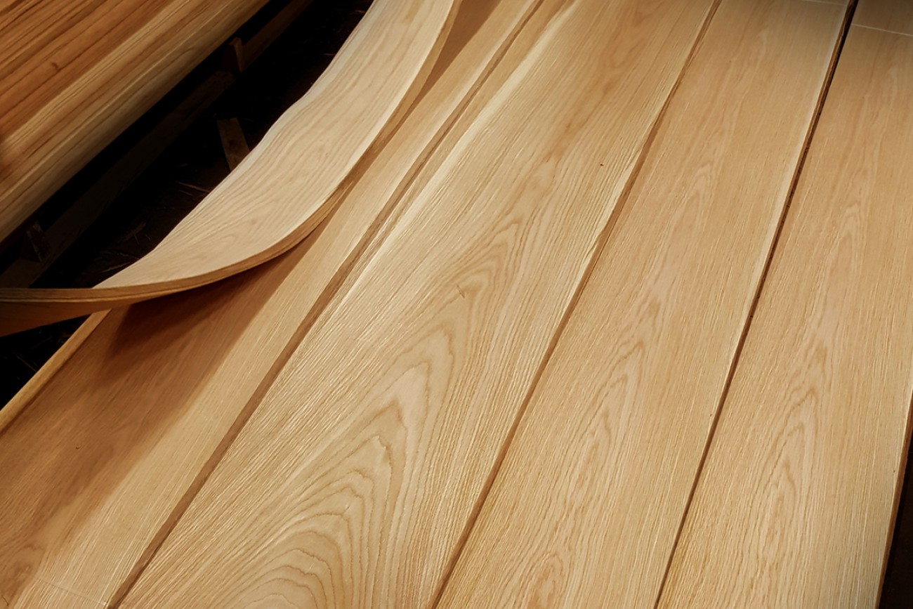
The beauty of real wood veneer offered in a unique product of extreme durability, extreme flexibility and bindability.
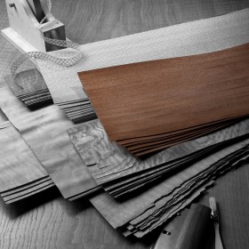
ENVYflex is HPL faced with real wood veneer and finished with ENVYflex heavy traffic eco-friendly compound.
ENVYflex is available in wide range of wood species and finishes.